
A variable font is a single font file that behaves like multiple fonts.
Roberto Sanchez
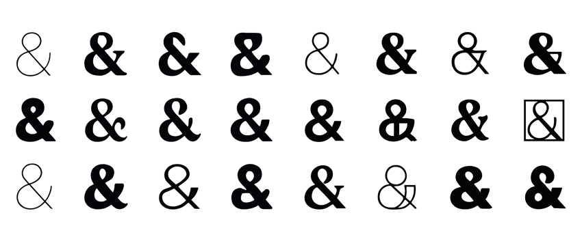
Typography is more than choosing a legible font — it’s a powerful tool in brand identity that communicates tone, character, and emotion before a word is even read. In the evolving world of design, variable typography is emerging as a transformative approach, allowing brands to express infinite personalities using just one flexible font family.
Variable fonts are streamlined, responsive, and dynamic — offering designers and marketers the freedom to tailor type to context without sacrificing performance or consistency. Let’s explore how this technology is redefining brand expression.
What Is Variable Typography?
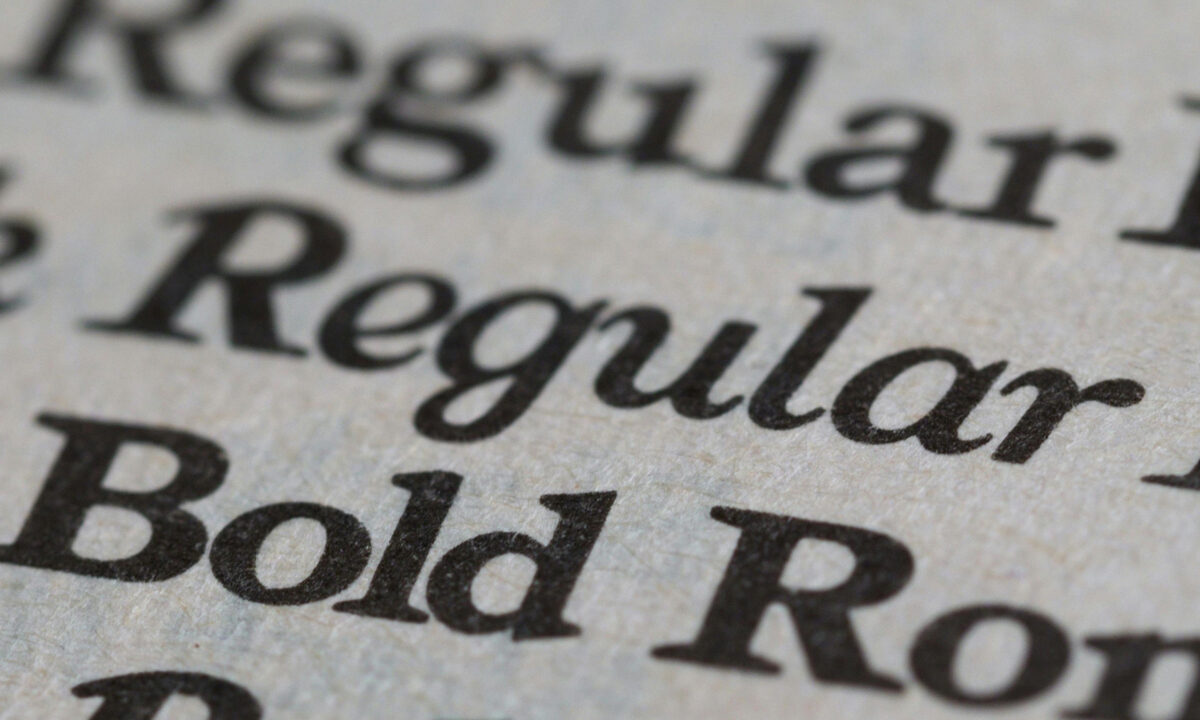
A variable font is a single font file that behaves like multiple fonts. Unlike traditional font families (where each weight or style requires its own file), a variable font includes multiple axes such as weight, width, italics, and slant — all adjustable in real time. This means designers can fine-tune typography with precision or generate subtle variations that enhance mood, hierarchy, and responsiveness.
Variable typography was introduced as part of the OpenType 1.8 specification, and it has since gained support across modern browsers and design tools. (Adobe Fonts)
Why It Matters for Brand Identity?
Traditionally, brands rely on a fixed set of font styles — a rigid “brand font kit” used across logos, headings, body copy, and digital interfaces. While this ensures consistency, it can limit creative expression. With variable typography:
- A single font can feel expansive: You can shift from bold and assertive to elegant and understated without changing type families. (Google Fonts Variable Fonts Guide)
- Responsive typography becomes seamless: Variable fonts adapt effortlessly to screens, devices, and UI contexts, improving accessibility and readability.
- Brand personality gains nuance: Instead of a static look, your typography can subtly react to context — creating variation without inconsistency.
This adaptability supports the emotional side of brand identity, allowing typography to echo mood and meaning without breaking brand guidelines.
Variable Fonts in Action
Because of its flexibility, variable typography is especially useful across:
1. Digital Interfaces
Responsive text that adjusts weight for readability at different screen sizes enhances UX without multiple font loads.
2. Branding Materials
Campaigns can tweak font personality (strong, playful, serious, elegant) while staying rooted in a core typeface.
3. Motion & Interaction
Variable weights and styles can animate, transition, or emphasize content in dynamic UI/UX designs.
4. Print & Packaging
One font family scales seamlessly across large posters, catalogs, and labels — maintaining harmony while supporting hierarchy.
Referencing the Google Fonts variable fonts guide helps designers understand how to leverage weight and width axes responsibly to support both aesthetics and performance. (Google Fonts Variable Fonts Guide
Benefits for Performance and Efficiency
One of the most significant technical advantages of variable fonts is performance. By consolidating multiple styles into one file, brands reduce load times and improve web performance — a critical factor for SEO and user engagement. (A List Apart: Variable Fonts Explained)
This efficiency makes variable typography a smart choice for modern digital brands focused on speed without compromising design quality.
Designing with Variable Typography: Best Practices
To make the most of variable fonts in your branding:
✨ Define core axes
Choose which attributes (weight, width, slant) matter most to your identity.
✨ Establish usage guidelines
Create rules for how variations express meaning (e.g., heavier weights for headlines, subtle widths for subheads).
✨ Test across platforms
Ensure legibility and personality remain consistent on desktop, mobile, and print.
✨ Combine with visual hierarchy
Use variable typography to guide focus — bold, wide, or condensed styles can signal importance.
Why It’s a Game-Changer for Magika Studios Clients
At Magika Studios, we integrate cutting-edge typographic strategies into brand systems that need impact with flexibility. Variable typography allows us to:
- Create brand expressions that feel alive across contexts
- Maintain visual consistency while supporting dynamic storytelling
- Support digital performance without sacrificing style
Variable typography is more than a font tech trend — it’s a strategic tool that unlocks infinite brand personalities from a single type system.

Final Thought
In an era where attention is fleeting and experiences matter, your type should do more than convey words — it should convey character. Variable typography expands what’s possible, letting brands remain consistent, expressive, and responsive in every interaction.
Ready to innovate your brand’s typography?

